


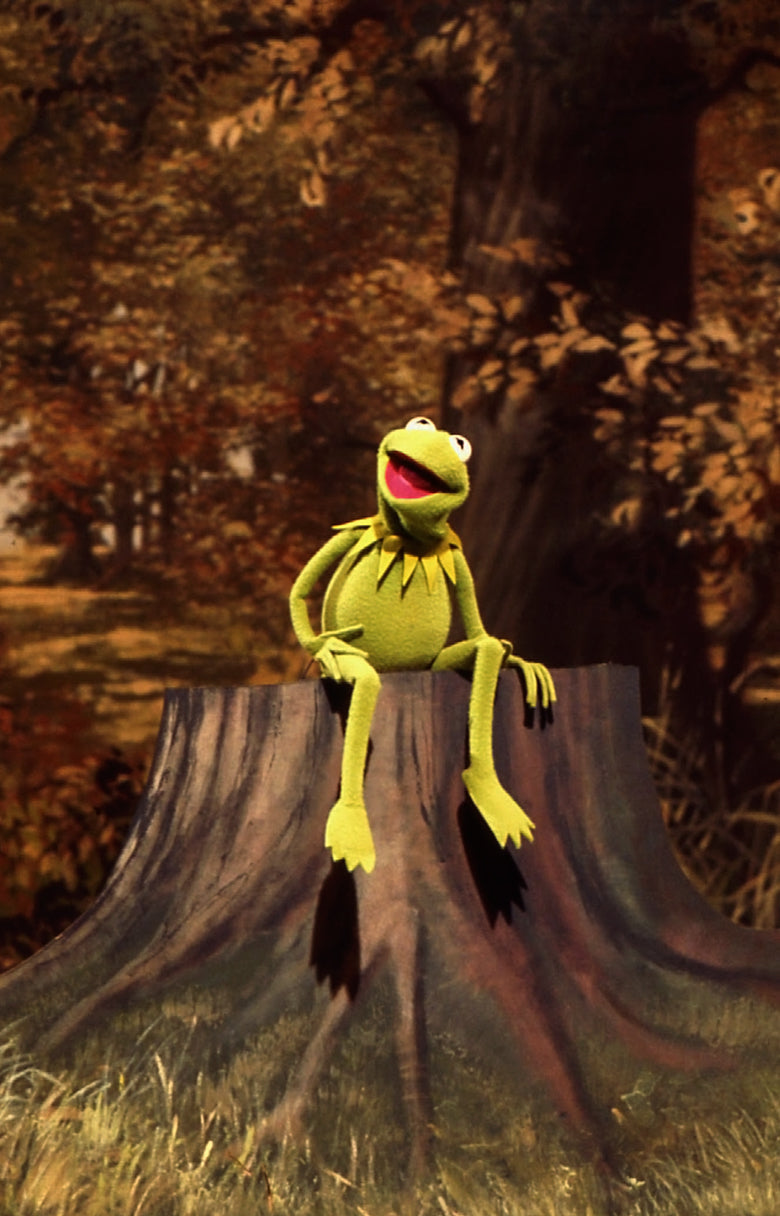
Move over Kermit, being green is easier than you think! That is, if you’re talking about incorporating Pantone’s 2017 Colour of the Year into your home decor!
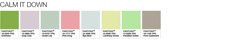
If you haven’t heard, the 2017 Colour of the Year is Greenery. The Pantone Color Institute describes the colour as, “a fresh and zesty yellow-green shade that evokes the first days of spring when nature’s greens revive, restore and renew. Illustrative of flourishing foliage and the lushness of the great outdoors, the fortifying attributes of Greenery signals consumers to take a deep breath, oxygenate and reinvigorate.”
So now that we’ve established this year’s most trendy colour, let’s look at how we can incorporate it into our home decor.
A Breath of Fresh Air
Revitalizing a room to include Greenery doesn’t have to break the bank! By simply adding the colour into a few room elements—such as in throw pillows or wall art—you can breathe some new life into an otherwise tired room. The naturalness of Pantone’s Colour of the Year also provides the opportunity to easily bring the outdoors in, so go wild!
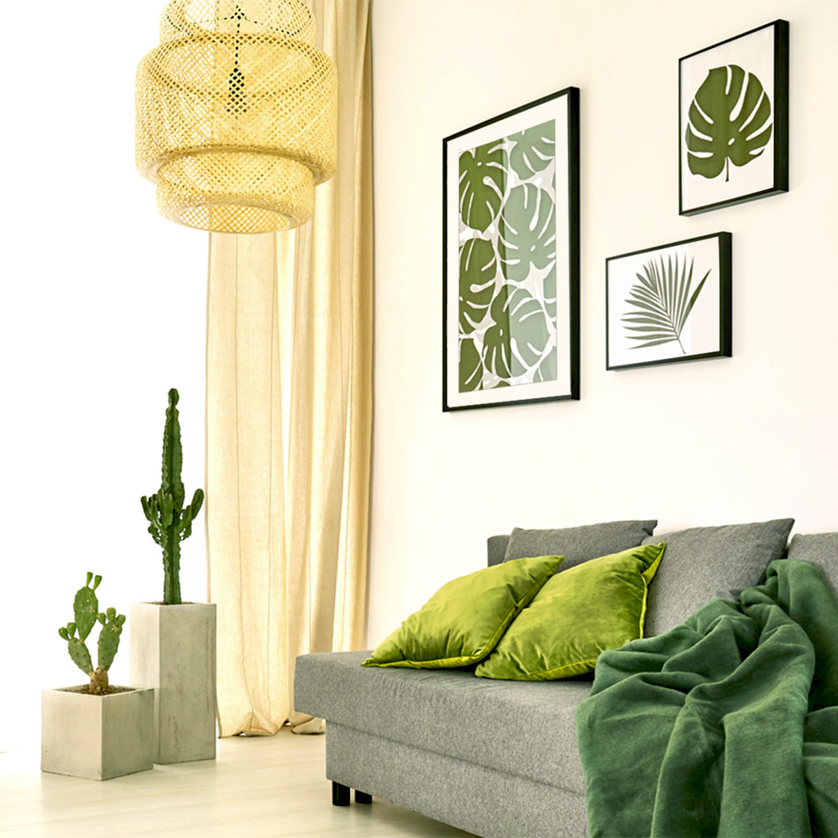
It Doesn’t Have to be All or Nothing
When decorating, don’t feel like everything needs to be green. Greenery is very versatile and can be paired with an abundance of different colours and shades.
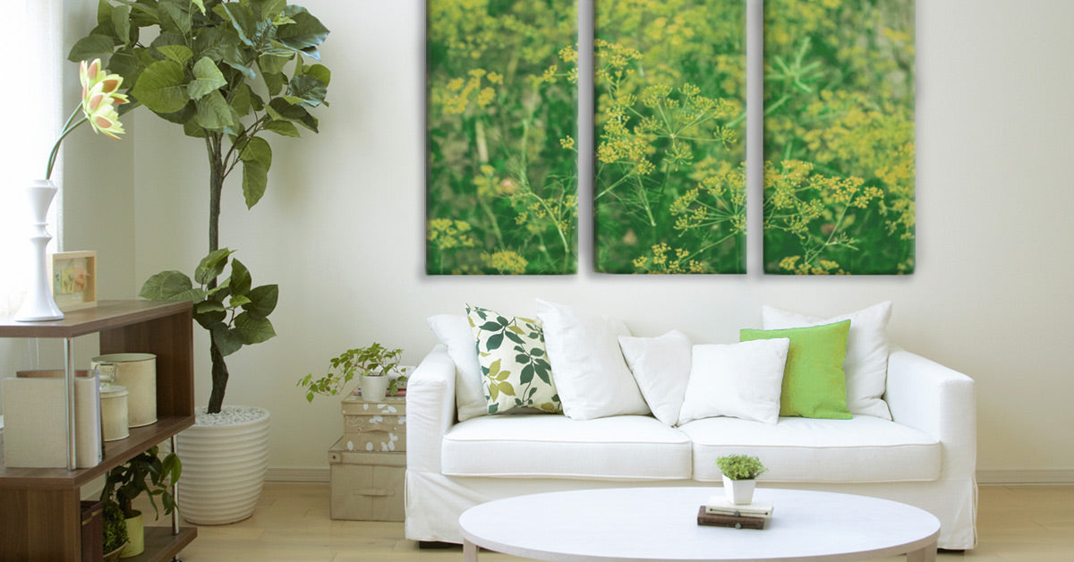
This room, which is featuring a Posterjack Canvas Print, has been inspired by two of Pantone’s colour palettes.
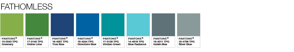
You can view additional Greenery colour pairings on the Pantone website.
Playing with Texture
From soft, fuzzy throw blankets to prickly cacti to smooth, glossy artwork, when you’re redecorating, consider including various textures. Similar to adding texture in photography, following this strategy in room design can greatly enhance the visual impact by adding dimension, contrast, and interest to the space.
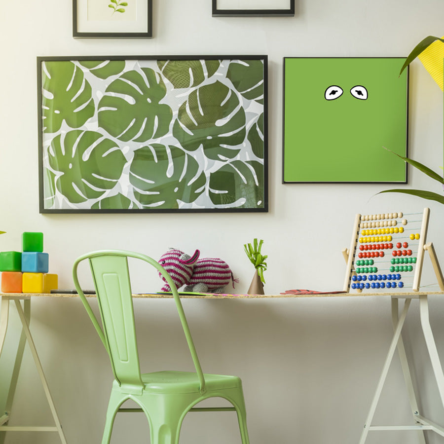
This room scene is featuring the timeless and elegant Posterjack Gallery Frame.
Ahead of His Time
Kermit sang about his woes of being green back in the 70’s but he managed to come to terms with it in the end, despite not knowing he’d be sporting the most popular colour nearly 50 years later. To quote the amphibian of the year:
“But green’s the colour of spring.
And green can be cool and friendly-like.
And green can be big like the ocean, or important like a mountain, or tall like a tree.
When green is all there is to be,
It could make you wonder why, but why wonder?
Why wonder, I am green and it’ll do fine, it’s beautiful!
And I think it’s what I want to be.”
Greenery: Love It or Hate It?
What do you think about the 2017 Colour of the Year? Are you embracing it, using it to refresh your home decor? Or are you counting down the months until the 2018 Colour of the Year is announced, hoping it will be something more to your taste? Leave a comment to share your thoughts!